Project Description
The project aimed to create a user-friendly application that would operate on both iOS and Android platforms for end-users in the UK and Europe. The goal was to provide a branchless banking experience using the power of technology while simplifying the traditional banking experience.
Challenge
The main issue is the poor user experience of leading banking brands and their mobile applications, while competitors have excelled in user interface and user experience design. Additionally, designing the application to incorporate third-party services while adhering to their terms and requests was a challenging aspect of the project.
What I did
At the outset, there was a limited understanding of the UK banking sector. To get a better idea of the product the CEO and his team wanted, a competitor analysis was conducted. The desired product features were listed and competitor applications were downloaded and their processes were recorded to produce feature lists. The recorded processes are also aided in creating future flows and understanding the processes within the design and development team.
In parallel, a brand guideline and press kit were developed in collaboration with the graphic designer on the team.
Detailed analyses of competitors in the market and those planning to enter it were conducted. Competitors’ official websites, app store comments, and feedback on sites like Trustpilot were used to prepare a report. Feature lists and competitor analysis reports were used for SWOT analysis.
Presentations were organised based on the research and analysis conducted, and feedback was gathered to reach a consensus on the product’s general direction.
Based on internal team feedback and research, targeted customer groups were asked questions, both internally and with third-party services, to understand user behavior. The responses provided information on important features, application usage times, and opinions on branchless banking. This research methodology was used due to the COVID-19 pandemic.
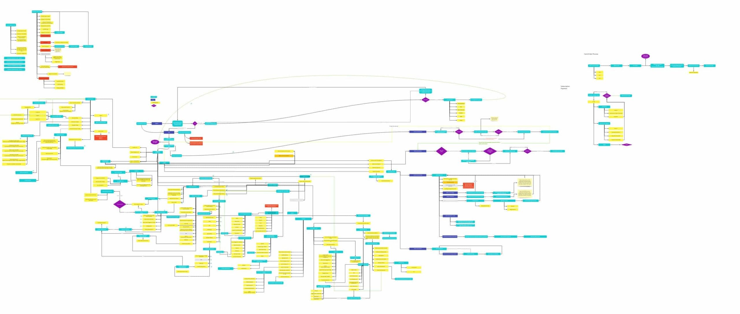
Low-fidelity business flows and user journeys were created using Miro. These flows were developed in collaboration with teams, and feedback was incorporated to obtain a product that was approved by all stakeholders.
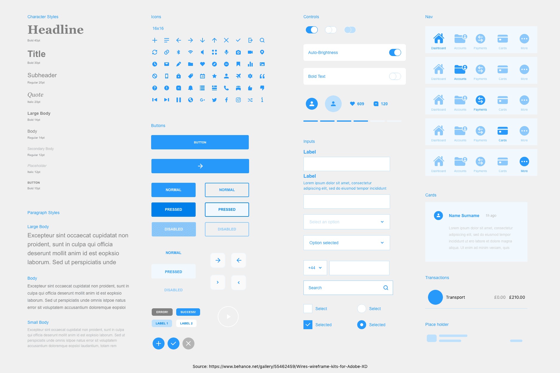
The information architecture structure was set up based on the approved low-fidelity flows. As team leader, backlogs were prepared through JIRA, and work was distributed via sprint planning meetings. The general components for the wireframe were developed with the atomic design system in collaboration with the team.
Low-fidelity flows were converted to high-fidelity wireframes, and a clickable prototype was created for testing. Test sessions were held by selecting 1 or 2 people from each department in the company. Based on the feedback, the user flows in the wireframe were improved, and user journeys were made more usable.
Flow and functional edits were made to the wireframe based on research results such as which functions were important to target customers and when they use the bank application. The final version of the wireframe was presented through sessions across the company, and a clickable prototype was shared for feedback. The feedback was evaluated with the team, final edits were made, and approval was obtained from decision-makers.
Based on research results, screens with the most impact were identified, and a one-week design challenge was initiated. Four different design concepts emerged, and one was selected through internal voting. Backlogs related to the design were created, and a design sprint planning meeting was held with the development team to start the design process of the applications.
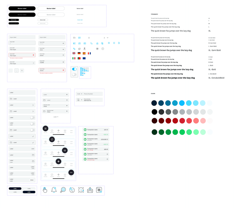
Wireframes were created using Adobe XD, but Figma was later chosen due to its superior design capacity and other features. The design process started from scratch in Figma, and a design system was created by designing components.
The design team initially focused on screens related to the user registration process, working in parallel with the development team. After completing this section, the design was checked, handed over to the software team, and a meeting was held with software team leaders to explain screen limits and interactions.
When the application was finished, screens were sent to the QA team for approval, and if approved, it was tested and approved again by the design team. Initial in-house tests were conducted, but it was found that the selected design was not usable, and a design challenge was initiated. This led to the creation of a more useful user interface, which was approved after sessions and feedback.
After being promoted to the position of Product Owner, design processes continued at the same pace. An MVP was created by bringing together the most necessary functions, while the application design and flows continued with all features. After the design was completed, user flows were rearranged for MVP, and a clickable prototype was produced for testing with internal departments. Feedback was incorporated and the design was handed over to the development team.
During the software process, documents such as the product’s business plan, income plan, and marketing plan were examined to identify deficiencies and uncertainties. A report was prepared, and necessary departments and C-level individuals were met to address the issues. A plan was developed to eliminate uncertainties, and communication with third-party services was maintained.
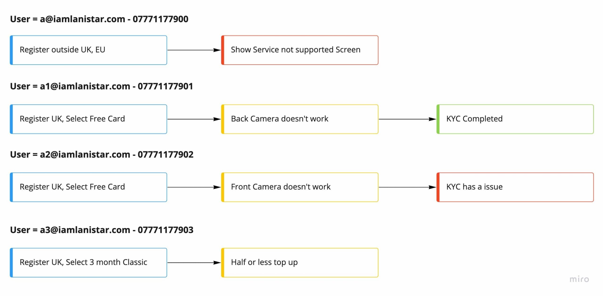
Test scenarios were prepared for the team and internal tests during alpha testing. Functional and behavioural tests were prepared for the beta process, and the scoring system and success criteria were determined. UX improvement cases are listed below.
For a detailed Figma prototype walkthrough, please request during the interview. Prior to the interview, email queries can be sent to info@kaanata.com (please mention the project name in the subject line).
